
Solution:
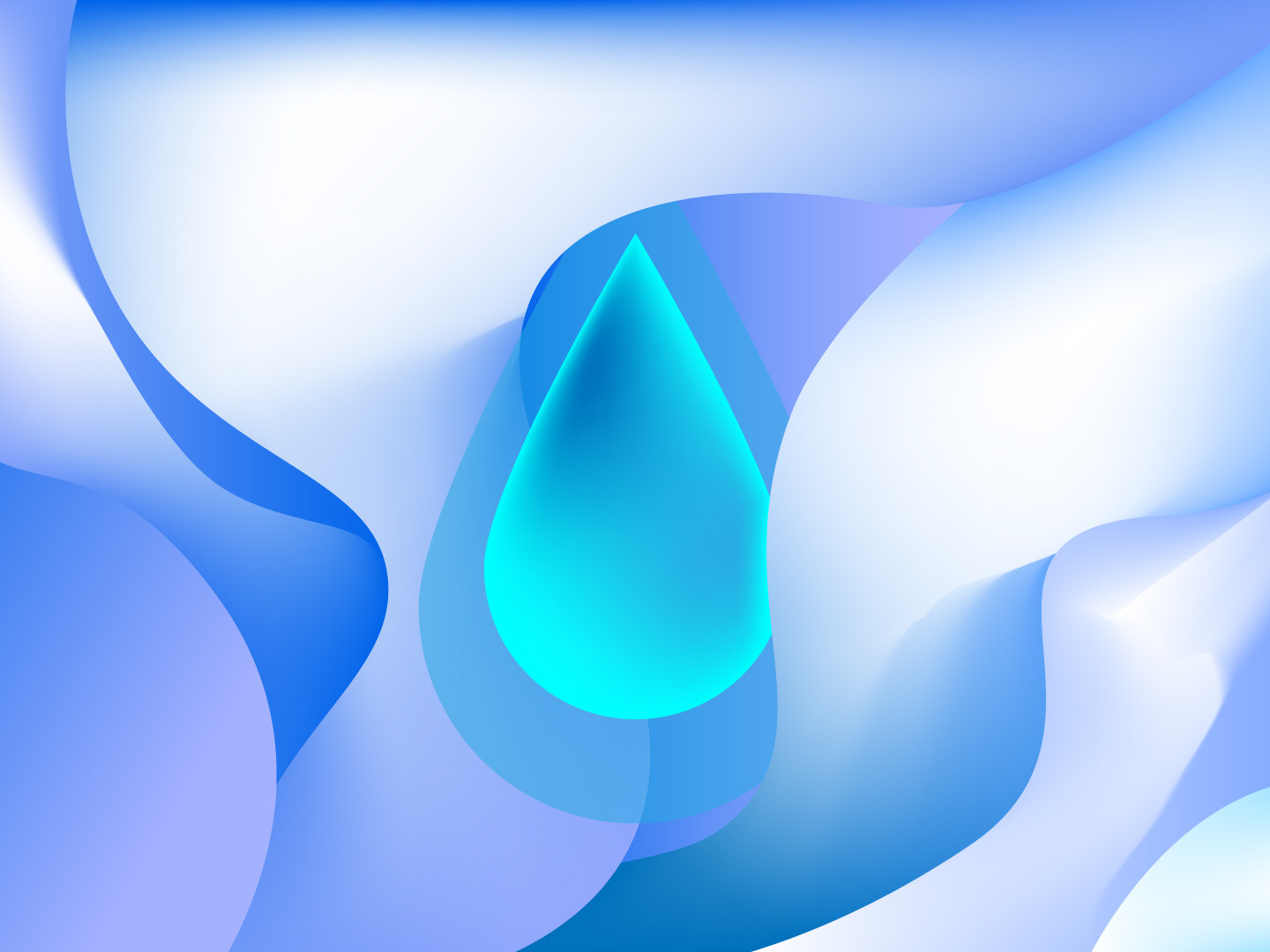
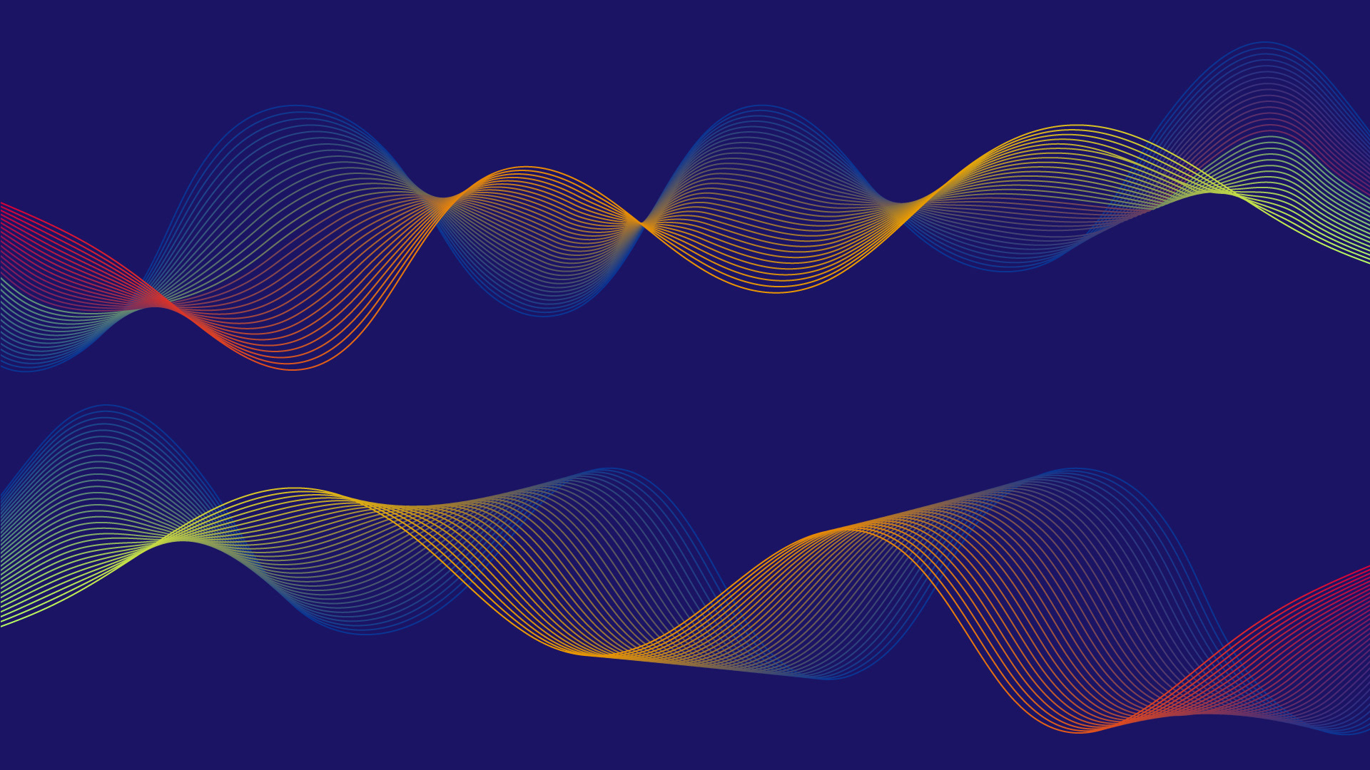
I designed overlapping curves that symbolize rhythm and harmony, using precise gradients to evoke a balance between movement and stillness. The repetition of the waves introduces structure while maintaining a dynamic, organic feel.
I designed overlapping curves that symbolize rhythm and harmony, using precise gradients to evoke a balance between movement and stillness. The repetition of the waves introduces structure while maintaining a dynamic, organic feel.
Color Palette:
Warm gradients (yellow to orange): Represent warmth, creativity, and vitality.
Cool gradients (blue to purple): Evoke calmness, depth, and sophistication.
Deep navy background: Highlights contrast and enhances visual focus.
Outcome:
The result is a versatile design that reflects modern minimalism with an artistic edge. Suitable for branding materials, digital interfaces, or standalone art, it showcases the beauty of simplicity in motion.
The result is a versatile design that reflects modern minimalism with an artistic edge. Suitable for branding materials, digital interfaces, or standalone art, it showcases the beauty of simplicity in motion.