
Solution:
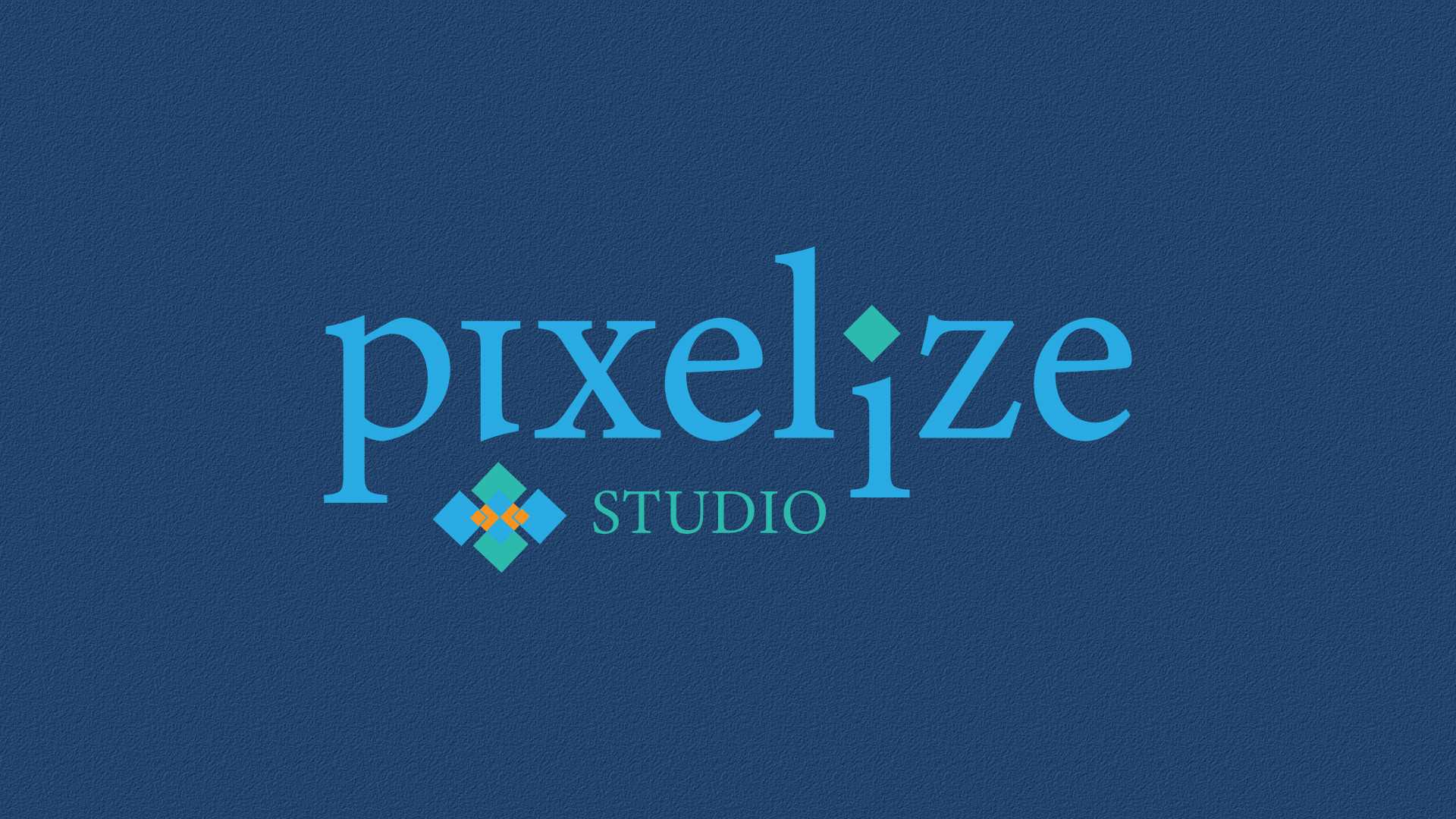
The logo features a clean, stylized typeface with playful variations in letter heights and unique details, such as the diamond shape over the "i," adding an extra visual twist. The icon below the text combines layered squares and a pixelated arrangement, representing the agency’s expertise in digital design. The choice of vibrant blue and teal colors conveys energy and creativity, with a sophisticated edge.
The logo features a clean, stylized typeface with playful variations in letter heights and unique details, such as the diamond shape over the "i," adding an extra visual twist. The icon below the text combines layered squares and a pixelated arrangement, representing the agency’s expertise in digital design. The choice of vibrant blue and teal colors conveys energy and creativity, with a sophisticated edge.
Color Palette:
Bright blue and teal tones that reflect a fresh, modern look while maintaining visual harmony and appeal.
Bright blue and teal tones that reflect a fresh, modern look while maintaining visual harmony and appeal.
Outcome:
This logo captures the essence of Pixelize Studio as a forward-thinking, innovative agency, attracting clients looking for cutting-edge digital design solutions.
This logo captures the essence of Pixelize Studio as a forward-thinking, innovative agency, attracting clients looking for cutting-edge digital design solutions.